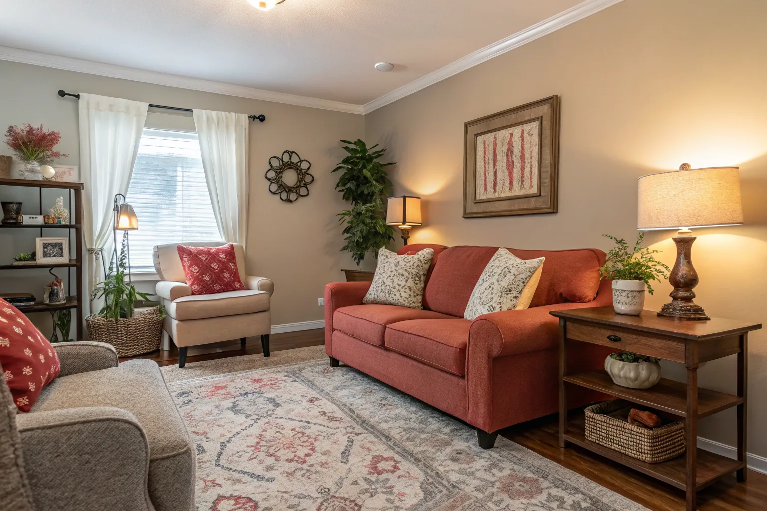
Brevity is the soul of delight: a single dash of color, expertly placed, can invigorate an entire room or transform a lifeless garden bed. Harnessing the power of accent hues is both an art and a science—one that invites even the most reserved palettes to sing.
Why Small Accents Deliver Outsized Impact
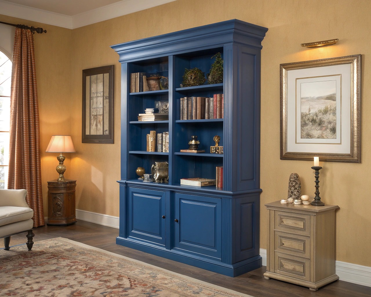
Strategic use of color accents leverages principles of visual hierarchy and chromatic contrast. A pop of bold pigment draws the eye and enlivens its surroundings, especially amid a base of neutral, natural, or subdued tones. This selective approach offers several benefits:
- Spatial Perception: Small color bursts can create depth, focus, or a sense of expansion in compact spaces.
- Emotional Resonance: Bright accents stimulate mood and foster engagement without overwhelming the senses.
- Flexibility: Accents are easy to adapt or update, keeping designs fresh across seasons and trends.
In landscape planning, I often use single intense blooms—like ‘Hot Lips’ Salvia or orange tulip cultivars—against soft green backdrops. The result? Movement and rhythm entirely out of proportion to their size.
Selecting Your Accent: The Science of Color Choice
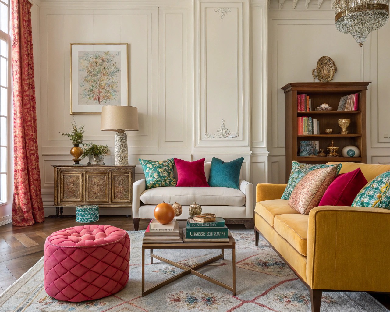
Color selection is both intuitive and grounded in color theory. For maximum visual clarity and enjoyment:
| Accent Color | Works Well With | Effects/Feelings | Outdoor Example |
|---|---|---|---|
| Crimson/Red | Dusty greens, grays | Invigorating, energizing | Red cushions, Acer foliage |
| Amber/Orange | Slate, taupe, navy | Warm, sociable, dynamic | Marigolds, terra-cotta pots |
| Cobalt Blue | Sand, beige, off-whites | Calm focus, serene sophistication | Blue-glazed urn, agapanthus |
| Citron/Yellow | Olive, charcoal, brown | Sunny, uplifting, enhances light | Daffodils, yellow ceramics |
| Magenta/Violet | Pale woods, linen | Playful, creative | Verbena, lavender throws |
Tip: For a naturalistic aesthetic, echo accent hues found in the native flora or the mineral tones of your local environment.
Practical Ways to Introduce Color Accents Indoors
Accent strategies indoors differ subtly from garden settings but rely on similar psychological and compositional principles.
Textile Touches
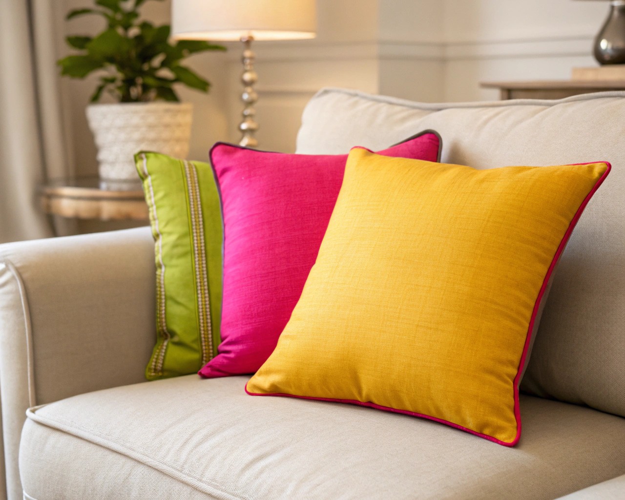
- Throw pillows, single curtains, or a runner inject liveliness without commitment.
- Opt for high-chroma, saturated fabric hues for sharpest contrast in neutral rooms.
- For a restful effect, layer analogous (side-by-side) hues—such as teal and navy—or use patterns sparingly for sophistication.
Painted Details
- Paint the interior edge of a door, a single bookcase, or stair risers in a bold tone for discreet, recurring visual pleasure.
- Semi-gloss, richly pigmented paints create jewel-box intensity even in small doses.
Functional Decor
- Lampshades, ceramics, or artwork serve as high-impact, mobile accents.
- Select objects whose shapes are simple, letting color take the lead visually.
Quick Checklist: Indoor Accent Placement
- Corners or recesses that need definition
- Areas opposite natural light sources for glow effects
- Entry points—thresholds, table arrangements
Bringing Accents Outdoors: Containers, Focal Points, and Living Color
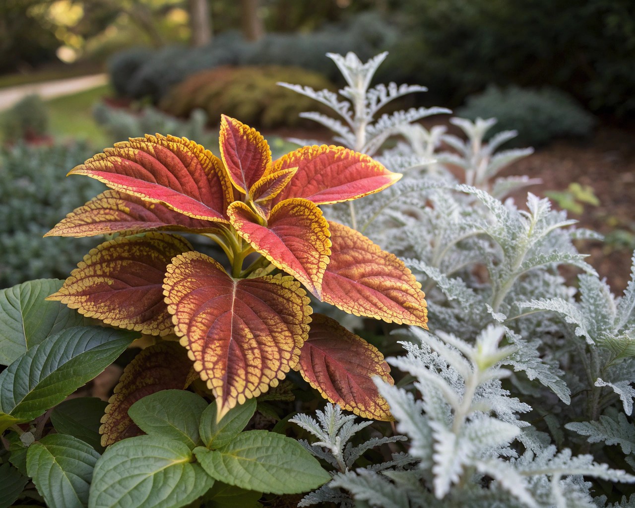
Small gardens benefit most from restraint paired with one or two vibrant elements.
Potscaping for Pizzazz
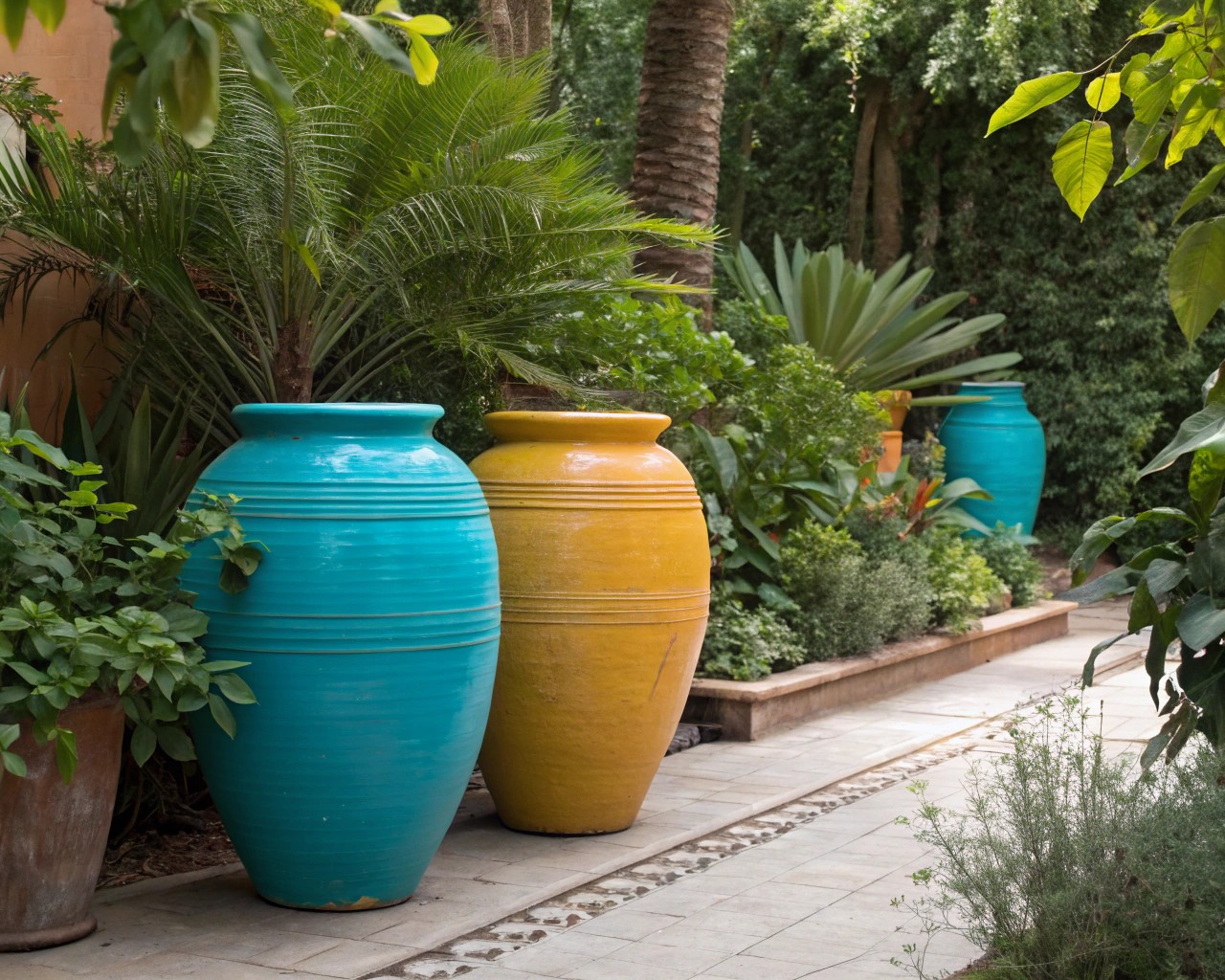
Container color can rival any flower when thoughtfully selected. I often recommend two strategies:
- Pair a bright vessel (e.g., saturated turquoise or ochre) with foliage-heavy, texturally rich plants to amplify both elements.
- Use a single strong accent (like a cobalt glaze) repeated in two or three different pot shapes for visual unity.
Living Color: Planting Beds and Borders
Accent-planting is both about species selection and spatial rhythm.
Step-by-Step Approach:
- Assess your base palette: Identify the dominant foliage and hardscape colors.
- Select 1–2 accent blooms that contrast with, not merely match, your base.
- Group in odd numbers (3, 5, or 7) for naturalistic effect.
- Echo color elsewhere: Repeat accents in mulch, gravel, or supporting flowers for cohesiveness.
Sample Layout:
| Bed Element | Color Family | Quantity | Placement |
|---|---|---|---|
| Japanese Forest Grass | Chartreuse | 5 | Foreground, full sun |
| Tulip ‘Ballerina’ | Burnt Orange | 7 | Mid-bed, clustered |
| Allium ‘Globemaster’ | Purple | 3 | Rear anchor, vertical pop |
Pro Tips for Lasting and Adaptable Color
- Use high-quality, UV-resistant paints and glazes for outdoor objects.
- Select perennials for living accents—annuals offer seasonal novelty, but perennials deliver foundational impact.
- Less is more: too many accent colors create discord rather than energy. Limit yourself to one or two for clarity and elegance.
Tip: If in doubt, photograph your design-in-progress in black and white—a good accent will still ‘read’ as a point of focus even without color.
Case-Study Snapshots (Adaptable Examples)
Urban Balcony, 60 sq ft:
Painted the underside of the railing in lemon yellow; echo with two table centerpieces (succulents in yellow pots). Neon-hued wool throws stay on the chairs for chilly evenings. The overall effect—welcoming and unmistakable from the street, without dominating the small space.
Narrow Entry Hall:
Added a single Persimmon red silk shade to a pendant lamp, with matching ceramic bowl below. The color draws visitors’ eyes forward, visually ‘lengthening’ the passage without feeling invasive.
Final Thoughts: Color is Courage in Small Doses
Small accents provide a safe, dynamic way to experiment with the transformative energy of color in any environment. By focusing attention—and delight—where it matters most, you can foster a sense of play, renewal, and coherence in both home and landscape design. Even the most conservative space will benefit from the “just-right” touch of boldness, achieved through careful material, placement, and chromatic selection.

